
Page 6 - August_Newsletter_2022
P. 6
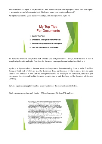
The above slide is a repeat of the previous one with some of the problems highlighted above. The slide is pret-
            ty unreadable and a whole presentation in this format would soon turn the audience off.

            My tips for documents again, are my own and you may have your own styles etc.


            To make the document look professional, consider your text justification. I always justify the text to have a
            straight edge both left and right. This gives the document a more professional and polished look to it.


            Again, as with presentations, a font that is easy on the eye makes for easier reading. I tend to go for Time New
            Roman or Arial, both of which are good for documents. There are thousands of other to choose from but again
            think of your audience. A poor font will soon put the reader off. While you are on the font, make sure you
            have a good size – too small and the document becomes hard to read. Too large and the document will become
            unwieldy.


            I always separate paragraphs with a line space which makes the document easier to follow.


            Finally, use an appropriate spell checker – US spellings can differ from UK spellings.