
Page 5 - August_Newsletter_2022
P. 5
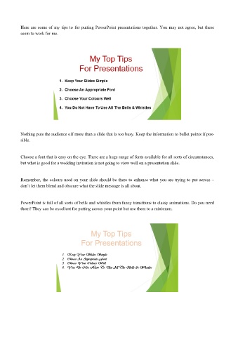
Here are some of my tips to for putting PowerPoint presentations together. You may not agree, but these
           seem to work for me.


           Nothing puts the audience off more than a slide that is too busy. Keep the information to bullet points if pos-
           sible.


           Choose a font that is easy on the eye. There are a huge range of fonts available for all sorts of circumstances,
           but what is good for a wedding invitation is not going to view well on a presentation slide.


           Remember, the colours used on your slide should be there to enhance what you are trying to put across –
           don’t let them blend and obscure what the slide message is all about.


           PowerPoint is full of all sorts of bells and whistles from fancy transitions to classy animations. Do you need
           them? They can be excellent for putting across your point but use them to a minimum.